Winning Deals Through Design: Simplifying Exago's Core Report Builder
Data Reporting Tool, Exago BI
Overview
After a year-long lull in sales, the CEO decided to make a dramatic change to the roadmap, dropping everything to elevate core product offerings, including Exago's most valuable and best selling report building platform.
Goals
Make the sales evaluation process more effective and address buyer concerns to secure deals
Improve the usability such that first-time users could build a simple report without guidance
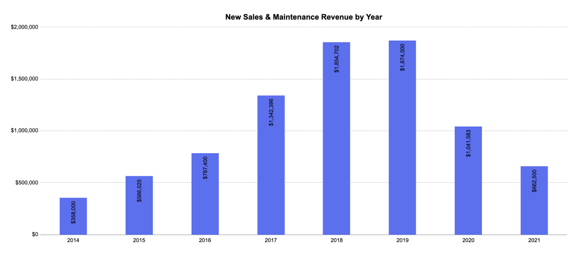
2018 and 2019 were Exago's best years for gaining new clients, but that momentum crashed in 2020.
Role
Product Designer
Tools
Figma, Zoom, Google Drive
Team
1 Product Manager
5 Developers
1 Sales Engineer
Timeline
8 months
Interviews
We spoke with sales and customer-facing colleagues
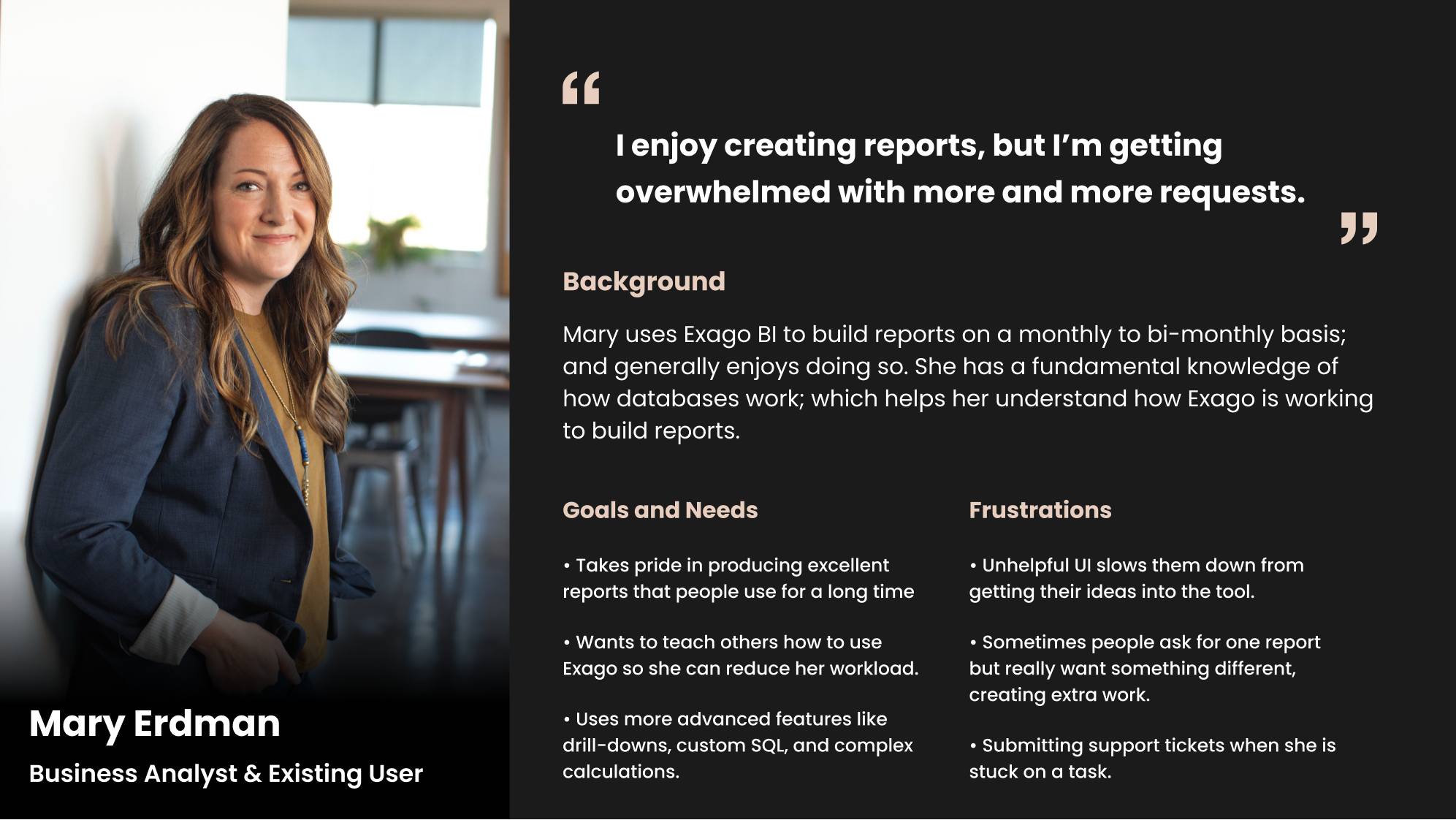
To identify different kinds of buyers, their needs, responsibilities, and frustrations. We cross referenced our notes with the projects overall goals to narrow our target audience down to two distinct personas:
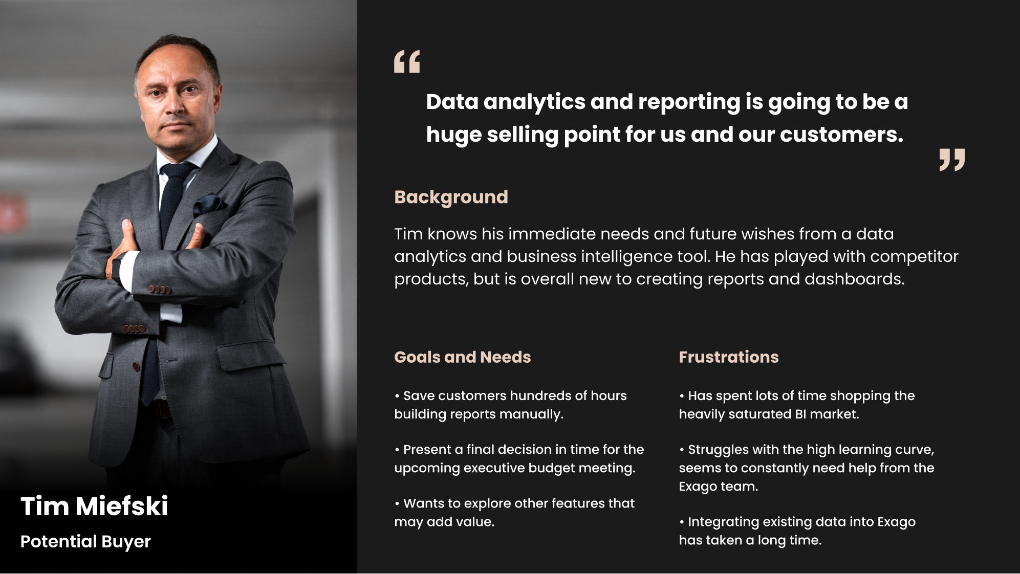
I met with Exago's senior sales engineer to understand what was causing people to say no to Exago's report creation tool. During our conversation, two unforgiving comments stood out and summarized the first problem well:
"There's an immediate negative reaction when sales introduces the advanced report designer to prospects."
Nick Avossa
Senior Sales Engineer
"This looks like the product we're trying to leave - if it hadn't been updated in 3 years."
One buyer during a sales call
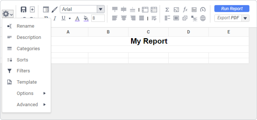
These comments weren't all that surprising; the tool's style hadn't been updated since it's inception in 2006.
It was, however, surprising to hear that more than half of lost deals specifically mentioned the outdated interface as one of the reasons they chose a competitor over Exago.

The outdated report builder interface, circa 2006
User Journey
Next, I asked Nick to walk me through the entire buyer's journey and point out where the biggest issues arose.
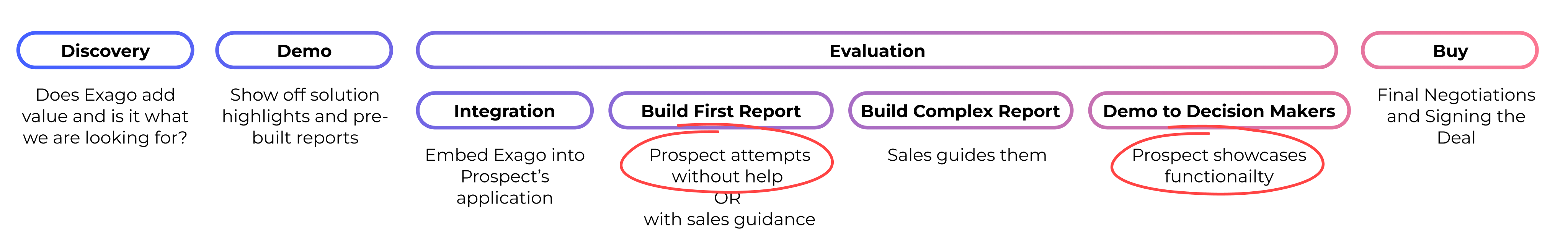
The sales evaluation process suffered from drop-off at two key points:
- Buyers trying to build their first report, especially when they went ahead of the sales team and tried it without guidance
- Internal demos, where buyers tried to convince the business to allocate budget
These efforts quickly devolved into frustration and distrust with the salesperson, making buyers skeptical that they, let alone their organization, could get value out of the product.
Internal Usability Testing
After establishing that usability was very low, I wanted to know exactly where people were stumbling throughout this process. To test this, I organized usability testing. The sessions highlighted unhelpful, unintuitive workflows and difficulties navigating the interface. At this point, we were armed with a clear direction for what to address under our limited timeline.
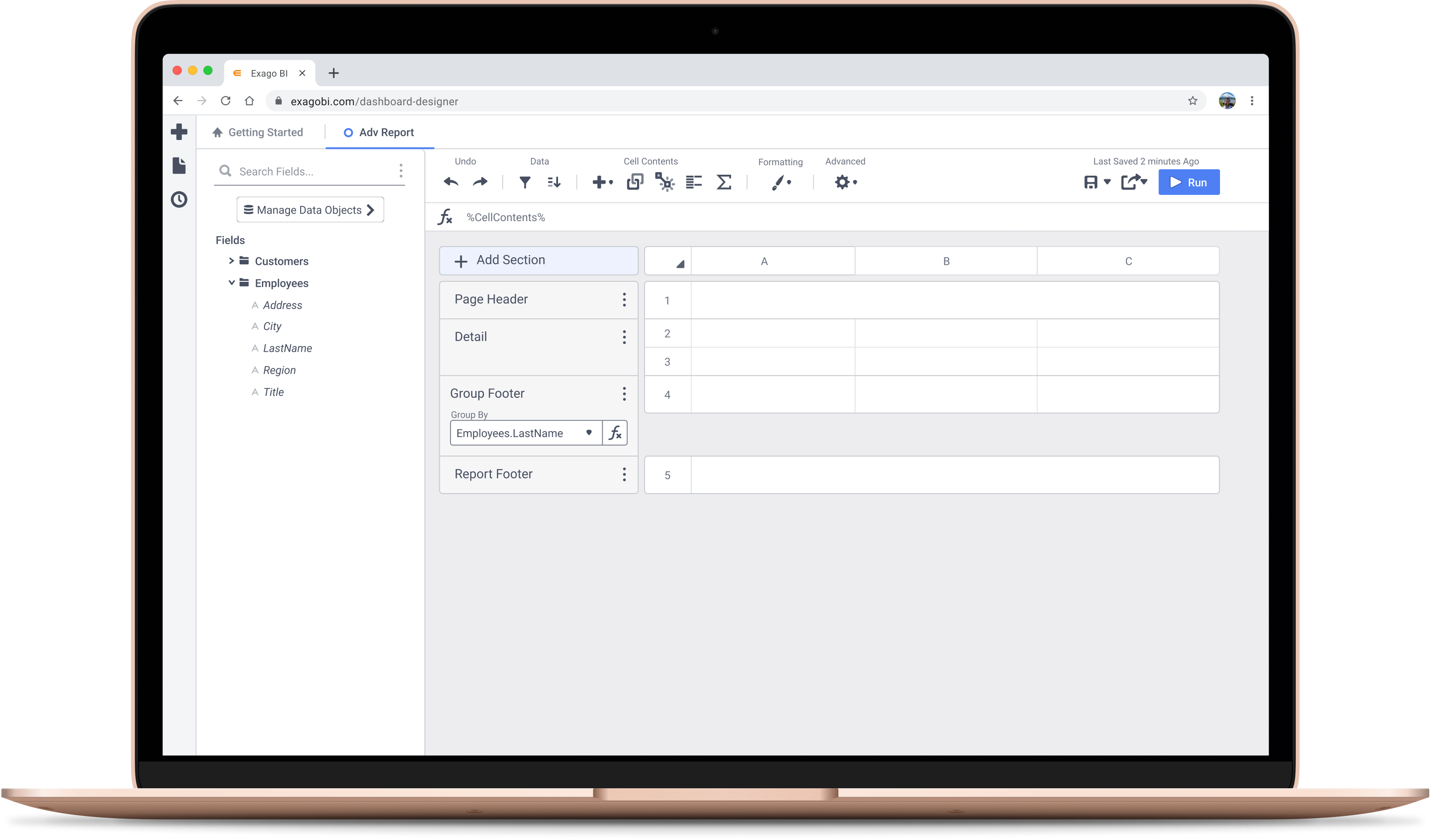
A Fresh Coat of Paint
Before: The outdated report builder interface, circa 2006
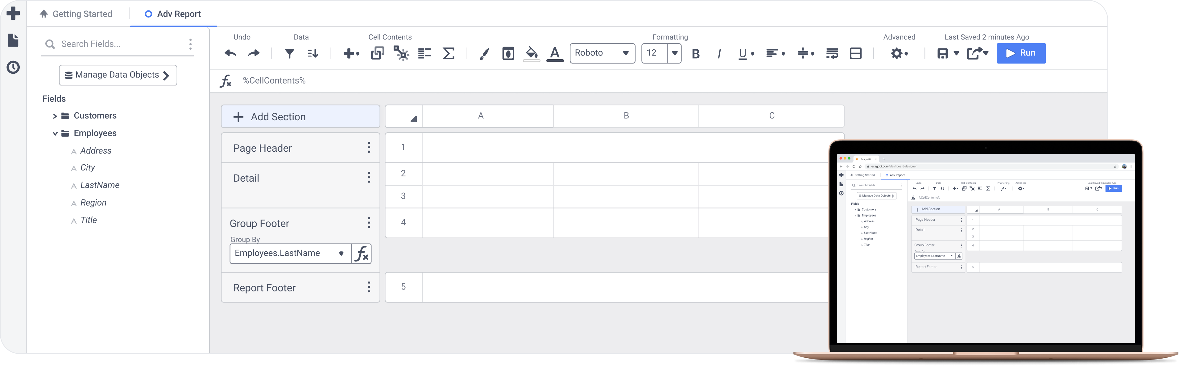
After: A cleaner, more breathable look that maintained it's core structure for long time existing users. I also introduced signifiers for previously hidden, important actions that user's failed to find during usability testing.
Fast and Familiar Interaction Design
According to Jakob's Law, users spend most of their time on other sites and therefore prefer your site to work the same way. We updated interactions to behave more predictably by mirroring Microsoft Excel and Google Sheets, further easing the learning curve.
Clean and Responsive Report Viewing
The highest-traffic page needed to be simple and flexible for all users.
3 Egregious Points of Friction
The Forced Wizard Workflow
When someone clicked Create New Report, they expected to start playing with a new shiny reporting toy, but instead were thrown into an unexpected workflow that killed momentum. We stripped the 5 step wizard down to a single dialog, saving people an estimated 17 seconds every time they build a report.
Before: A bloated, 5-step process that disoriented users.
After: A simpler dialog that builds anticipation for the next screen.
Desire Path Blocked by an Error State
New and experienced users alike would run into an annoying error over and over, indicating a "desire path."


Desire Paths: Good design accounts for the fastest or most common path for users to get from A to B.
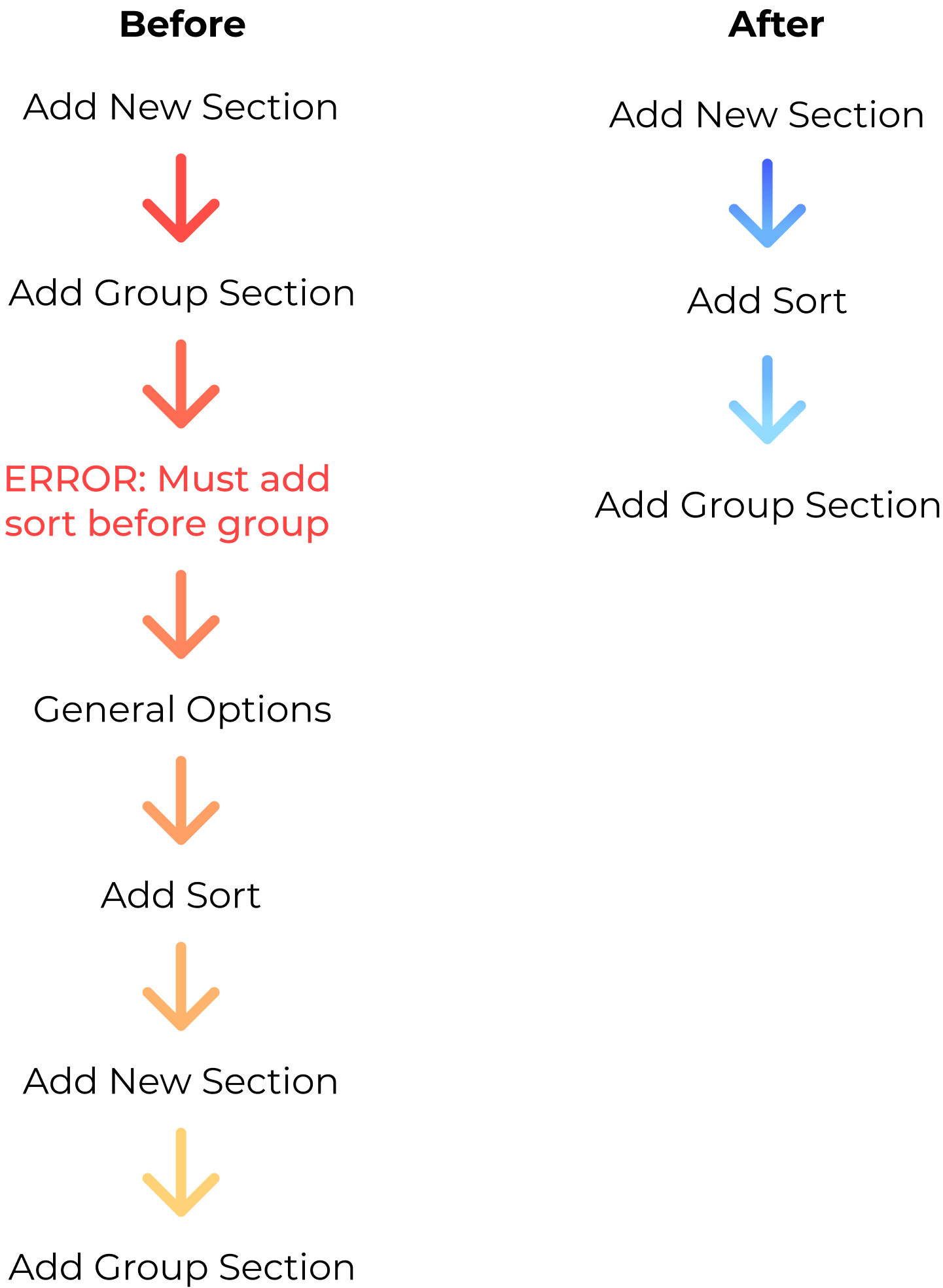
Updated Flow: We couldn't fully eliminate the step, but integrated it into the workflow and prevented the error.
The Information Architecture
People struggled to locate options - I watched many users hover over every single icon in the toolbar before finding what they were looking for.
Before: The most important options were hidden under a single icon.
2nd Iteration: I surfaced options people use for nearly every report and introduced labels to make the toolbar easy to scan.
First Click Testing
Sensitive to those with years of muscle memory, I was determined to test toolbar changes with existing users - despite having no allocated time for it.
I was handed the perfect opportunity, a chance to present at Exago's client conference.
In 4 hours total, I achieved testing with 20+ clients and the highest rated presentation of 8 speakers.
Based on a post-conference survey.
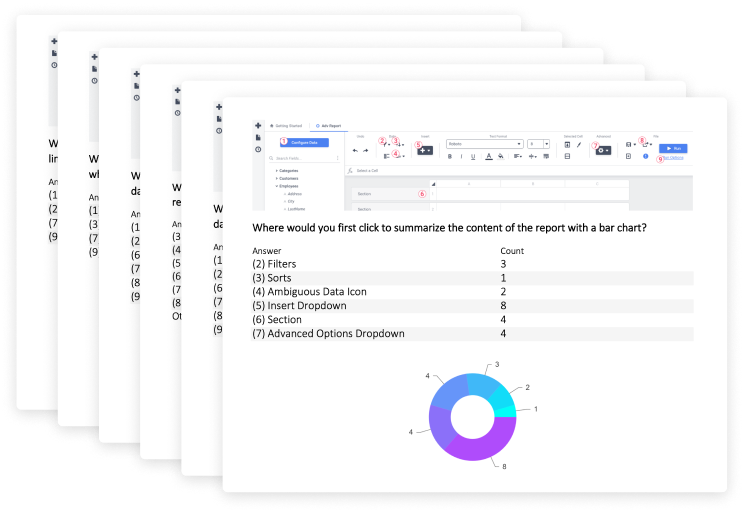
The conference was over zoom that year due to the pandemic, so I leveraged annotated screenshots and zoom polling to collect responses, then used the report designer itself to analyze and share the test results.
Outcomes
Fewer questions during sales calls, reduced support tickets, and more upgrades.
Nick noticed buyers stopped having a severe negative reaction to the interface, but people still needed at least some training to use the tool effectively. The usability improvements helped, but weren't quite enough for first timers to build a realistic report without help.

Sales Numbers
We released these improvements in Q1 of 2021, but by Q3, Exago was acquired. We can only look at the first two quarters, where Q1 and Q2 had better results than 2020 and were comparable to Exago's best years - indicating that we were poised for a great year in sales.
This data is unfortunately not enough to qualify the project's impact, nor does it tell the story of outside factors - like turnover in the sales department, the COVID-19 pandemic, and fluctuations in the BI market.
Customer Excitement
Reduction in Support Tickets
for usability related support tickets
Upgrades to the Newest Release
3.5x more than previous release
14 upgrades sounds small, but this indicated a huge leap in improvements. The process is painful, resource intensive, and can take up to a year to accomplish. The usability updates, along with one other big feature helped drive this result.